Alphabet: the new surprising Google brand architecture
Read More




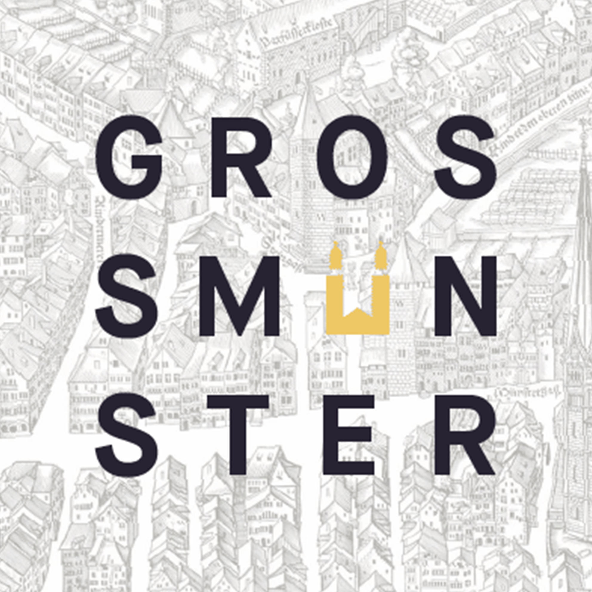
Attracting visitors from all over the world – Zurich’s Grossmünster Church has become many things to many people. A tourist attraction for those on a religious pilgrimage to a community epicentre for its active congregation. Creating a brand strategy to allow the Church to continue and evolve its relationship with both, become a necessary must.
In today’s day and age, it’s not enough to simply rely on your loyal customers to keep returning. And for religious attractions sometimes your loyal “customers” are only one segment of an audience which you’re trying to retain and grow.
The Zurich’s Grossmünster Church is a famous tourist attraction steeped in history, art and music. Encouraging more and more people to walk through their doors, this increase in popularity means that it attracts different visitors looking for different things.
In order to meet everyone’s needs and communicate in a way which everyone can relate to, a strong communications and brand strategy needed to be applied.
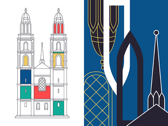
Working with brand agency, Moving Brands, the Grossmünster board decided that they needed to create a distinct identity to present the church as a “social/religious haven, as well as an international destination for art and culture”.
For any organisation a branding strategy has to be well executed, well planned and well thought out. For a church to start thinking about their marketing strategy certainly brings them into the 21st Century and also shows how they want to stay relevant and reach out to more people.
So for branding agency, Moving Brands, they played on the story of the Grossmünster, to provide them with their starting point for developing, in marketing terms, ‘a premium religious brand’.

The Grossmünster story reported in Moving Brands is about music and silence, words and The Word, the sacred and the social. What the team needed to demonstrate was how they communicate this story, turn it into the Grossmünster “brand” and reflect it in their image, their visual identity, and their communications. Everything needed to represent the story they’d uncovered.
Most important building a contemporary feel to the buildings long history.
“The story acted as a design directive for the visual identity, which brings a contemporary perspective to the building’s long history. The symbol represents the unmistakable outline of the church, while the wordmark represents the vibrant civic life that the church attracts. The colour palette is influenced by the world famous stained-glass windows. The typeface and typographic style (GT Sectra, by Swiss foundry Grilli Type) are suggested by the typography used in the Zurich bible.”
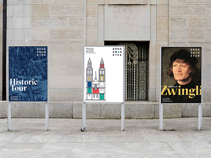
The subtle use of the change in marketing comms, as well as the new colours interlinking with the detail in the Church all help to bring the brand strategy together. The brand architecture which Moving Brands created allowed different strands to be applied to their different audiences, depending on who they were communicating to. The flexibility of the brand image allows it to have different meanings to different people and allows it to be easily tailored to that particular audience.
---
It’s important for a brand to have this level of flexibility when it has multiple audiences such as this. No one wants to be excluded and for the Church to recognise this in their brand will only heighten its popularity and continue to place it on the map as a great tourist attraction.
Speaking to Moving Brands, Sascha Weisshaupt, Head of Communications at Grossmünster, commented, “Taking the challenge of a branding project for a Swiss icon like Grossmünster was both an experiment and a responsibility. But just as museums and hospitals have realised, I believe our organisation also has to work with the creative power of a brand, so we can engage with our stakeholders and stay relevant in the future. I was impressed how fast, how well and with how much passion the team at Moving Brands captured the essence of Grossmünster’s complex identity and turned it into an emotional story and beautiful design. We are very happy – and everyone who sees it, loves it!”
References and Pictures: Moving Brands


